4 - How did you use media technologies in the construction and research, planning and evaluatiuon stages?
Tuesday, 15 May 2012

Monday, 14 May 2012
EVALUATION-What have you learned from your audience feedback?
3- What
have you learned from your audience feedback?
From our
audience feedback, we have learnt that people found it hard at the beginning to
understand weather the mockumentary was supposed to be real or believable. They
didn’t necessarily understand what was going on and they found this a little
confusing. They said that the title cards helped with this, yet these title
cards were hard to see as the writing was quite small.
"I LIKED THE WAY IT CHANGED IN THE MIDDLE"
None of the
focus group said they had witnessed this kind of situation themselves and they
didn’t realize that it was such an issue among teenagers and they thought that
this mockumentary helped them and would help other people to realize the
dangers. The majority of the focus group were aged between 17 and 18 but we had
one teacher, this pretty much matcyhed our target audience.
Charlotte’s
character reminded a lot of the focus group of an American teenager which made
them feel like our mockumentary was similar to an American teen movie.
The focus
group didn’t say that they wanted to know what happened later on, as they didn’t
feel that there was a later on.
"NOT VERY REALISTIC BUT IT MADE SENSE WITHIN THE GIVEN GENRE"
The last
question, people had a mixed feeling about. Some said that if a drug results in
death then it isn’t for a good or legit reason and therefore it is just as bad
as other drugs.
On the
whole people enjoyed our film and were impressed with it, they thought that
more time would have resulted in maybe a better production but the enjoyed it.
"IT WAS VERY INFORMATIVE"
In general
comments, people said that it looked like a real documentary and was very professional
looking.
Sunday, 13 May 2012
EVALUATION- How effective is the combination of your main product with ancillary texts?
2- How effective is the combination of your main product with ancillary texts?
Our movie poster targeted teenagers. We used anindependent style that appealed to the niche audience that we tried to attract.We used a de-saturated image which connoted the nostalgic and independent stylewe wear aiming for. The poster revealedthe main subject of our film, Ben Collins, the boy who died and the title ofthe movie, ‘Why did Ben Collins die?’ A name that catches your eye andsummarizes what the mocumentary is all about.
 We made a double page spread for a magazine,featuring an interview with us, the directors, and a summary of themocumentary. This was similar to the two art house magazines, ‘Little WhiteLies’ and ‘Sight and Sound’. Both magazines targeted a certain niche audiencesimilar to the one that we wanted to attract to our mocumentary. We consciouslydecided not to use successful actors as we didn’t want the audience to bedetracted from the films verisimilitude. Therefore the magazine article focusesmore on us, the directors of the mocumentary and our motivations and reasonsfor the film.
(CLICK ON PIC TO SEE LARGE)
Our movie poster targeted teenagers. We used anindependent style that appealed to the niche audience that we tried to attract.We used a de-saturated image which connoted the nostalgic and independent stylewe wear aiming for. The poster revealedthe main subject of our film, Ben Collins, the boy who died and the title ofthe movie, ‘Why did Ben Collins die?’ A name that catches your eye andsummarizes what the mocumentary is all about.

(CLICK ON PIC TO SEE LARGE)
Saturday, 12 May 2012
EVALUATION- In what ways does your media product use, develop or challenge forms and conventions of real media products?
1- In what
ways does your media product use, develop or challenge forms and conventions of
real media products?
The media
product that we chose was a short film, a ‘mocumentary’. To create this mocumentary, we developed and
challenged forms and conventions of real media products. The two genres that we
chose to use were Teen and documentary and so we experimented with their forms
and conventions. We joined these two genres’ together to form a hybrid movie as
we didn’t want to just create a Teen movie or a documentary. After researching
about them we decided as a group whether or not each convention would be suitable
for our mocumentary.
In our mocumentary we have used ‘real’ footage,
in the way that we have used real photos of our main subject, ‘Ben Collins’. We
used these photographs to make the mocumentary seem more ‘real’. A convention
that we used that we were not planning to use was using a handheld camera.

We
only used this in part of the mocumentary and for the beginning we had a very
formal and conventional style which split the style of our mocumentary. We
however didn’t use voice over to guide our audience through this break in
style, the reason being, that we thought a voiceover was too influential and
leading for the audience. Instead we wanted it to be a hybrid which would
create an active audience rather than a passive audience.
We referenced the convention of interviewing
experts in our mocumentary. This could be called ‘pastiche’ as it was a fake
expert in our ‘fake’ world, this could have been regarded as mocking real
documentaries.

One convention that we did use to help guide
our audience throughout our mocumentary was text. We used this to show time,
place and what was happening. This is ordinarily would be the voice of code.

The codes and conventions from a teen movie
that we used were that we situated our mocumentary in a high school and we included
a relationship and illegal substances.
Thursday, 10 May 2012
Wednesday, 9 May 2012

Production
Having watched the final copy of our Mockumentary and spent time annotating and analysis it, i have found a few small mistakes. For example, there isn't a question mark after 'Why Did Ben Collins Die' at the beginning of the film. Another mistake is a spelling on 'regularly' and a few other small ones. Overall i really like the way that it has coem out an di think it is very succesful and has conveyed what we wanted to achieve.
Tuesday, 8 May 2012
Tuesday, 1 May 2012
Shoot report
During the day when we shot the scenes with Archie and Phoebe, a few changes were made. For example when the mobile phone goes off and Phoebe storms out the room. This was decided while filming the scene, i think that this works nicely and it gave us a chance to experiment with a handheld camera. We had some trouble witht the mobile phone going off at the correct time as i had to send a text message to her phone at the exact right time, whilst trying to make no noise. We also added the scene where the camera follows Phoebe down the stairs and hides behind one of the computers, filmin gher talk to Archie. This was written in the script but the directions were cvhanged.
We had a problem with Archie learnign his lines, as hye found this particularly difficult so we allowed him to change some of the words around to suit him better.
When we filmed Vesna who played the Doctor, she was very easy and quick to film as she acts part time anyway. This was really good as she could direct herself and instantly became a very good character as a Doctor. Kerim, Ben's personal tutor was also particularly straight forward to film as he learnt his lines, and understood is character well, although we did have trouble with his articulation.
Rough cut analysis
• Spelling mistakes in text
• Change font of titles and add in some
• Music at opening and ending of film
• Add fade ins and outs
• Titles
• Add in mother scene
Having seen the film for the first time, I think that it will appeal to our target audience a great deal and although it is a mocumentary it could be seen as quite emotional. There are still a lot of alterations to be made but so far I am pleased with what we have done. The timing exceeds the guidance so we shall examine what can be cut and try and do that. There are a few small mistakes, such as spellings but that can easily be changed. We are planning on going on Sound Cloud and other similar websites to find appropriate music the opening and ending of the film. This will help with the atmosphere of the film and should be a good finishing touch. We have yet to film the last scene of the Mother talking to the reporters and that should conclude the film nicely.
Thursday, 26 April 2012
Friday, 30 March 2012
Thursday, 15 March 2012
Wednesday, 7 March 2012
Target audience description
Our target audience mainly
consisted of Caucasian 18-25 year old Males, living in the South West mainly
looking at London as our main Area. The majority do not read film magazines and
seem to be attracted to movies based on their storyline and stars. According to
our ratings the genre of the movies is the thing our target audience cared the
least about. A significant portion of our audience stated that their preferred
way to consume movies is online via the Internet and streaming websites as
opposed to actually going to the cinema.
The favored genre for a
feature film is the Drama genre while Horror movies are featured in Short
Films.
Our movie is targeted at a
male audience mainly which is highlighted by several artistic choices within
our mockumentary. The story revolves around the death of an alpha male, a young
student who was overly bright, talented and popular. Out of the two main
characters Tom and Charlotte, Tom is the one the audience is able to sympathize
the most as his character offers redeeming qualities where as the character of
Charlotte is almost antagonized and is supposed to upset the viewer with her behavior.
Wednesday, 22 February 2012
Poster Shoot Plan
A rough plan and collection of ideas for the shooting of our official movie poster. We brainstormed things such as Equipment, Costumes and generally needed Props.
- Gels
Equipment
- Lights
- Studio
- Camera (Nikon/Canon DSL)
- Tripod- Gels
Costume (ideas)
- White shirt and cardigan
- Collared t-shirt
- Glasses
- Gelled hair
- Skinny jeans
- Tracksuit bottoms
- Rugby shirt
Props
- Rugby ball
- Football
- Pen
- A*
- Prefect badge
Tuesday, 21 February 2012
Tuesday, 7 February 2012
Our Movie Poster
After having done our poster mock up awhile back (for the tutorial and the mock up click here), and having shot our pictures for the poster, we were finally able to edit the final version of the poster. Mostly, we are happy with how the poster turned out although we are going to have a few adjustments, such as possibly changing the position of the image and changing the credits at the bottom of the poster. As of now, we used a template from the internet which looks out of place. Other than that, we are happy how the poster turned out. At the moment, we have two version but we are most likely to use the more saturated version (the one on the left), with the actor looking to the side.


Thursday, 2 February 2012
Poster Image - Editing Process
After choosing our favourite pictures in Adobo Bridge, we tried various ways of editing in Adobe Photoshop. We used two different, one of our actor facing the camera and one of him looking away. Both images are shot with a year book style. We took the photographs in our school studio where we could control the lighting and had a black back drop. This brought simplicity to our shoot.
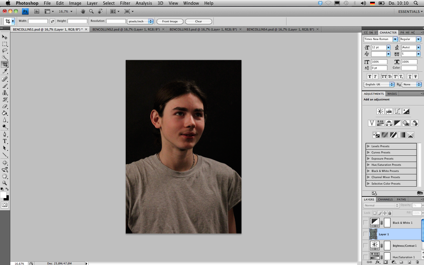


We proceeded by adding a texture over the image which added a bit of grain, again, this was to create a vintage style to our image. We then played around with the "grey-scale" and the "hue & saturation" tool having two final versions to choose from. The black and white version and the slightly saturated version.


For the second image we chose a similar editing style. We again worked with the "levels" tool to adjust the lighting and the contrast of the image and also altered the "exposure" settings in order for the image to soften.


Then, just like the fist image, we added the same texture and put its opacity down in order for it to only slightly affect the image. We finished by using the "hue and saturation" tool.
Subscribe to:
Posts (Atom)