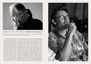
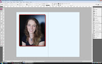
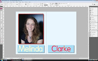
 Before creating our actual magazine spreads, we tried around InDesign and created two different Mock-Ups in order to establish what kind of layout we want to use for our own article. The first layout is quite a simple one with a small range on different colours, appealing to a more niche and arty kind of magazine such as "Little White Lies". The second spread is aimed at a more mainstream magazine, using more colours, different shapes and sizes and less text in order to appeal to that kind of magazine readers.
 TUTORIAL: WHAT WE DID IN IN DESIGN
First, we created a new InDesign file and made a double site spread. We started of with choosing the background colour. As this spread is aimed at a more arty magazine, we didn't want anything to vivid and distracting but didn't want to leave it white either. We choose to go for a greyish creamy mix. In order to set this as the Background colour, we created a large "Content Frame", and used the "Swatches" option to create our colour. Then we arranged the "Content Frame" to be set in the back of the page in order for us to be able to put the article on top. We continued by looking for a picture online that we could use as a Director's portrait. Then, we created tree columns and using the various grid's InDesign has to offer, we sized them all the same and justified the text within them.
We proceeded by adding a heading and a subtitle. We decreased the tint of the subtitles as we wanted it to look subtle and didnt want it to distract from the heading or the picture. In order for the double spread page not to look too plain and boring, we went trough the various available fonts and changed from "Arial" to "Times New Roman" for the columns and "Trebuchet" for the Heading. The last step in creating this double spread was to find another picture of our fictional director and to put it on the page at the right. We choose another black & white image to maintain the sort of contemporary and classy vibe of the previous page.


For the second doublespread page, we decided to use an female director. Again, we started by setting the background colour. Again, we used a "Content Frame" and the "Swatches" option to choose a colour of our choice and set it over the two pages. We then arranged it to be in the back again. As opposed to our first layout, we decided to keep the director's picture in colour and also had a more colourful approach on the rest of the page. Using a "Text Frame" and the "Swatches" we created the Heading of the pages, maintaining blue as the dominant colour on the page, but colouring the Heading in Red and yellow in order for a more vivid and quirky vibe.
We continued by creating a few columns with an place holder text. We again, justified the text and edited various parts of it to make it look more like an interview. We did so by bolding various parts and leaving the "answers" in regular writing. Then, to finish this double spread, we created a stroke and a different background for the text columns, using the colours red and white in order to stay in sync with the colours previously used on the Page.


No comments:
Post a Comment