Wednesday 22 February 2012

Poster Shoot Plan

A rough plan and collection of ideas for the shooting of our official movie poster. We brainstormed things such as Equipment, Costumes and generally needed Props.

Equipment
- Lights
- Studio 
- Camera (Nikon/Canon DSL)
- Tripod
- Gels


Costume (ideas)
- White shirt and cardigan
- Collared t-shirt
- Glasses
- Gelled hair
- Skinny jeans
- Tracksuit bottoms
- Rugby shirt

Props
- Rugby ball
- Football
- Pen
- A*
- Prefect badge

Tuesday 21 February 2012

Poster Final

Poster Final

Finished Magazine Spread

Finished Magazine Spread

PRODUCTION SCHEDULE

65050591-53933051-Production-Schedule[1]

Tuesday 7 February 2012

Our Movie Poster

 After having done our poster mock up awhile back (for the tutorial and the mock up click here), and having shot our pictures for the poster, we were finally able to edit the final version of the poster. Mostly, we are happy with how the poster turned out although we are going to have a few adjustments, such as possibly changing the position of the image and changing the credits at the bottom of the poster. As of now, we used a template from the internet which looks out of place. Other than that, we are happy how the poster turned out. At the moment, we have two version but we are most likely to use the more saturated version (the one on the left), with the actor looking to the side.


Thursday 2 February 2012

Poster Image - Editing Process

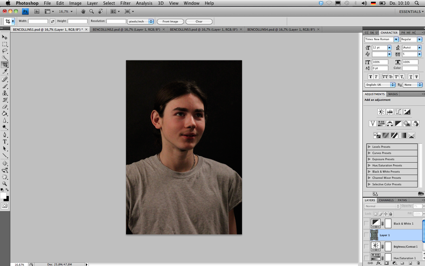
After choosing our favourite pictures in Adobo Bridge, we tried various ways of editing in Adobe Photoshop. We used two different, one of our actor facing the camera and one of him looking away. Both images are shot with a year book style. We took the photographs in our school studio where we could control the lighting and had a black back drop. This brought simplicity to our shoot. 

We used various tools to edit the two images. We started by using the "levels" tool in order to adjust the lightness and contrast of the image and then used the "exposure" tool to soften the image and create a vintage old style.
                     
We proceeded by adding a texture over the image which added a bit of grain, again, this was to create a vintage style to our image. We then played around with the "grey-scale" and the "hue & saturation" tool having two final versions to choose from. The black and white version and the slightly saturated version. 


 For the second image we chose a similar editing style. We again worked with the "levels" tool to adjust the lighting and the contrast of the image and also altered the "exposure" settings in order for the image to soften.

Then, just like the fist image, we added the same texture and put its opacity down in order for it to only slightly affect the image. We finished by using the "hue and saturation" tool.

Two Final Magazine Layouts


Magazine Spread - Basic Layout

Finally, we designed the actual magazine spread in InDesgin. Important Note: The actual Text is not done but the pictures and the layouts are.

What we did in Photoshop


We started by pressing Ctrl + D to insert my Portrait. Originally we were thinking to put both our portraits in but we thought the layout looked much more interesting with the emphasis on one of us. We then inserted an image of us during the interview on the second page, much smaller, but making clear that this is an interview.


We then proceeded to add some text using the "Placeholder"-text tool. We arranged them and decided where the text would look the best. We also added a subtitle for the actual title "Why Did Ben Collins Die" making it look much more neat and less empty and spacy. As the background colour for the two pages are different we decided to highlight this in the colour of the heading aswell, something we first saw in the magazine "Little White Lies"


Magazine Spread Images- Editing

After looking at magazines such as "Little White Lies", we knew that that sort of niche magazine would be right for  our movie. Pictures in niche magazines such as "Little White Lies" are usually edited mildly to look a little more edgy etc. We decided to change the saturation of the images and go for a sort of grey scale-esque style just like our initial magazine spread layout.


What we did in Photoshop


 We started by using the "Levels" tool on Adobe Photoshop to adjust the right amount of Brightness and Contrast. We then used the "Hue & Saturation" tool to minimize the colours on the image. This way it looks more classy, edgier and is more likely to be in a magazine such as "Little White Lies".


For the interview still of both of us ,we edited in a similiar way to the portraits but instead of using the "Hue & Saturation" tool to cut down on the colours, we decided to go all the way and used the "Black & White"- Tool. Other tools we used were again the "Levels"- Tool to adjust brightness and contrast plus the Filter selection "Lens Distraction" to add a subtle vignette around the image.